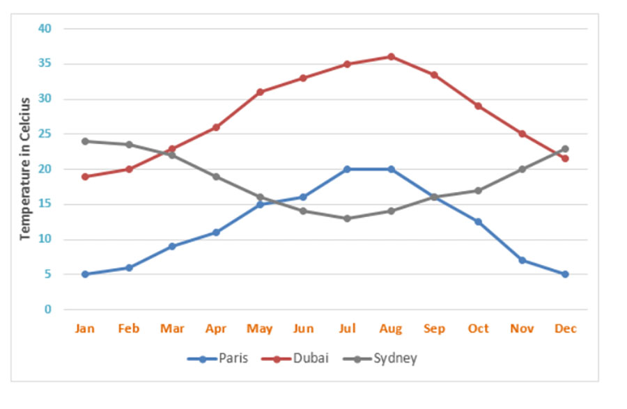
The line graph below shows the average monthly temperatures in three major cities.
Summarize the information by selecting and reporting the main features, and make comparisons where relevant.
The line graph illustrates how much the temperatures mean monthly in three cities, such as Paris, Dubai, and Sydney, from January to December.
Overall, it is clear that the quantity of the temperatures in Dubai city was the highest during this time. In addition, while Dubai and Paris cities decreased in the last month of the year, the opposite was true for the Sydney area.
As can be seen from the chart, Sydney saw its hottest of the first month of the year, which was around 25 degrees. Following this, the figure experienced a decrease trend to under 15 degrees celsius in July and then increased to roughly 24 degrees in December. The figures for the Sydney location were considerably decreased from 22 degrees to 13 degrees between March and July.
Additionally, the monthly average temperature in the Dubai area was approximately 20 degrees, higher than in Paris at 5 degrees in January. Despite increasing to over 35 degrees, the figure for the Dubai city decreased to around 21 degrees in December. Similarly, 20 degrees was dramatically increased by Paris in July, before remaining unchanged in August, it decreased sharply by 5 degrees in December.