Tổng hợp bài mẫu IELTS Writing Task 1 dạng Line Graph
Chú ý: Link download ở cuối bài.
Bài mẫu IELTS Writing Task 1 – Line Graph #01
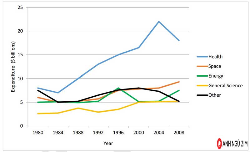
Topic: The graph below gives information about U.S. government spending on research between 1980 and 2008.
 The line graph provides information about the U.S government’s expenditure on research in five fields (Health, Space, Energy, General Science and Other) over the period from 1980 to 2008.
It can be clearly seen that the US government spent the largest amount of money on research into Health while the least amount of money was spent on researching General Science.
Starting at $10 billion in 1980, the government expenditure on research into Health slightly dropped over the next four years before continually rising again to a peak of nearly $25 billion in 2004. Despite declining back down to approximately $18 billion in 2008, expenditure on Health research was by far the highest. The amount of money spent on researching General Science however was the lowest of all research categories, beginning at $2.5 billion in 1980 and rising to just over $5 billion by 2008.
Meanwhile, there was also an increase in the money that was spent on research into Energy and Space, from approximately $5 billion and $6 billion in 1980 to around $7.5 billion and $9 billion in 2008, respectively. In contrast, the only field that experienced an overall decrease in expenditure was that of research into other areas, which fell from approximately $7.5 billion in 1980 to about $5 billion by 2008.
By ZIM
Tham khảo thêm: |
Bài mẫu IELTS Writing Task 1 – Line Graph #02
Topic: The chart below shows the unemployment rate and the number of people leaving Ireland from 1988 to 2008.
 The chart gives information about the percentage of unemployed Irish citizens and the number of emigrants leaving the country from 1988 to 2008.
Overall, there was a significant decline in the unemployment rate in Ireland, and in addition to this, the number of those leaving the country also reduced over the examined period.
Regarding Ireland’s rate of unemployment, after a mild decrease from roughly 17% in 1988 to 13% in 1990, it experienced a slight recovery to about 15% over the following two years. The figure then plummeted to 4% in 2000, followed by a six-year period of stability. However, the unemployment rate of Ireland increased to nearly 6% in the final year.
Starting with approximately 60,000 emigrants in 1988, this number fell to about 55,000 in 1990 before plunging to over 32,000 two years later. The number of Ireland’s emigrants continued to go down to around 27,000 over the next 12 years, and suddenly surged back up to 50,000 in 2008.
By ZIM
Bài mẫu IELTS Writing Task 1 – Line Graph #03
 The line chart illustrates the proportion of female parliament members in Germany, Italy, France, the UK and Belgium from 2000 to 2012.
In general, all countries experienced an upward trend over the period, with Italy being the country with the highest percentage of female parliament members in 2012.
The percentages of female members of parliament in Germany and Italy were always higher than those of the other three countries however they also experienced a similar trend. While the figure for Italy rose from 27% to just under 40%, that of Germany increased by only 4%, to be at about 37%, during the examined period. Starting at 25% in 2000, the proportion of female parliament members in France increased at a similar rate to Germany, to end up at approximately 32% in 2012.
In 2000, only around 3% of parliament members in the UK were female, however this figure rose quite substantially to about 20% in 2008 and continued to peak at roughly 23% in 2012. The percentage of female parliament members in Belgium also stood at 23% in 2012, however this figure only showed a small change from its figure of around 17% in 200.
By ZIM
Bài mẫu IELTS Writing Task 1 – Line Graph #04
Topic: The line graph shows the number of people who used different communication services in the world.
 The line graph gives data about the number of users of five different communication services worldwide from 1998 to 2008.
Overall, all services experienced some growth over the 10 year period, with cell phone and Internet services experiencing the most growth and becoming the most popular forms of communication.
In 1998, the figures for cell phone and Internet users started at around 5% of the population. They both increased over the remaining years, with cell phone service gaining the highest position in 2008, with more than 60% percent of the population using this type of service. This number was approximately three times as much as that of Internet service in the same year.
Meanwhile, throughout the 10-year period, little change was seen in the use of landline services, at about 15% of the population. Also, the use of mobile and fixed broadband services was minimal before 2002. The figures for these two services rose slightly to roughly 5% of the population by the last year.
By ZIM
Bài mẫu IELTS Writing Task 1 – Line Graph #05
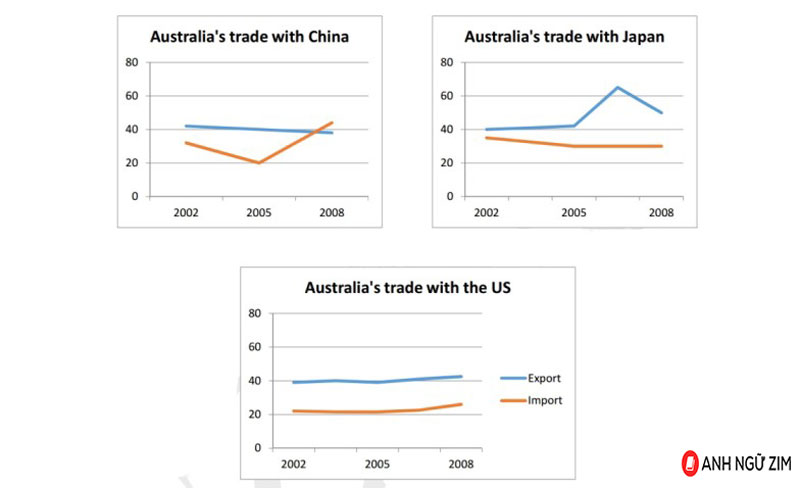
Topic: Australian trades with China, Japan and the US
 The line graphs show data on Australian trades with three other countries, namely China, Japan and the US.
The initial impression from the graphs is that Australia appeared to earn the highest revenue from exports to Japan. Additionally, Australian-American import-export values remained relatively static over the given period.
Regarding trades between Australia and China, exports underwent a gradual decrease from approximately 43% in 2002 to 40% in 2008. The figure for imports from China stood at about 30% and showed an upward trend to a high of around 43%, despite having an unexpected dip of about 3% in 2005.
Australia’s exports to Japan, after remaining stable for the first three years, soared to its peak of over AU$60 million in 2005, after which this figure halved to about AU$30 million in 2008. Meanwhile, imports from Japan remained consistent at a value of approximately AU$37 million throughout the period.
Trades between Australia and the US appeared to be the most stable, with both import and export values stabilized at around 23% and 40% respectively.
By ZIM
Bài mẫu IELTS Writing Task 1 – Line Graph #06
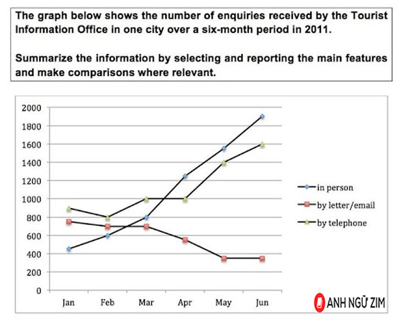
 The line chart illustrates the number of inquiries sent to the Tourist Information Office in a particular city via three means of communication , between January and June in 2011.
It is clear that visitors to the city made more inquires in person and via telephone, while written letters and emails became the least common choices. Additionally, the number of enquiries in person experienced the most dramatic change among the different options.
In January, the Tourist Information Office received 900 telephone enquiries, while just under 800 letters and emails were received. Not many tourists chose to ask for information in person, with just over 400 queries. Over the next three months, the telephone still remained the most popular method of enquiry, at approximately 1000 queries.
Meanwhile, the number of enquires made in person saw considerable growth to 800, surpassing the figures for emails and postal enquires . From March to June, enquires in person were the most common method of inquiry. By June, the number of in person enquires soared by more than 1,000 to peak at 1,900. During this period, there was also a significant rise in the figure for telephone enquiries, from 1000 to 1600. By contrast, fewer people sent emails or letters to make enquires, with slightly less than 400 enquires in May and June.
By ZIM
Tổng kết
Trên đây là một số bài mẫu IELTS Writing Task 1 dạng Line Graph. Ngoài ra các bạn còn có thể tham khảo thêm các bài mẫu Writing IELTS khác được Anh ngữ ZIM tổng hợp và biên soạn qua tài liệu dưới đây.
Bên cạnh đó tham khảo thêm khóa học ôn luyện IELTS để nắm cách làm bài, thí sinh cần ôn luyện thật thường xuyên và trau dồi thêm vốn từ vựng, ngữ pháp của bản thân trong khi luyện thi IELTS để đạt được band điểm cao trong làm bài thi IELTS Writing Task 1 dạng Line Graph thật.
Tải tổng hợp 15 bài mẫu IELTS Writing Task 1 dạng Line Graph tại đây.

Bình luận - Hỏi đáp